Tag: The Lightbox

  • Nagihan Seymour: The Golden Ratio

    Nagihan Seymour: The Golden Ratio

    by Carla Scarano D’Antonio

    14 January–2 April 2023, The Lightbox, Woking

    Captivating and inspiring, the new exhibition in the Upper Gallery at The Lightbox in Woking displays the artworks of Nagihan Seymour. She features the patterns of Turkish art (15th century), linking them to the Golden Ratio and the Fibonacci sequence and creating high-quality geometric patterns in the style of Tezhip art illumination (Tezhip meaning ‘ornamenting in gold’). She uses 11–24 carat gold leaf in her works as well as acrylics, gouache and watercolour paints, exploring the Golden Ratio in geometrical designs which are connected to the natural world and express the ornamental patterns in repetitions of shapes and in stylisation.

    Butterfly effect, 2022

    Nagihan Seymour trained to be an engineer so her roots are in science and mathematics, and she combines these with her knowledge and practice of illumination that she has been studying since her university years in Istanbul. She had two previous solo exhibitions at The Lightbox in 2017 and 2021. Her responses to traditional Turkish art are precious and contribute to a unique vision that in the past was used to illustrate significant works such as poems and the Quran.

    In art the Golden Ratio has been interpreted as a divine proportion; it is mentioned in Luca Pacioli’s De Divina Proportione (written in 1497 and published in 1509), which was illustrated by Leonardo da Vinci with three-dimensional geometric solids. The idea is aesthetically pleasing and the forms refer to the natural world, for example in the shape of the nautilus shell and in the human body. The Golden Ratio creates order and balance in interesting compositions that are simple and beautiful. The preciousness is in the detailed and precise repetitions and juxtapositions of forms and in the use of pigments, especially the gold leaf, which might be linked to the sun, while the blues might represent the sky in a cosmos perspective. The connection with the Fibonacci sequence validates the pictures related to the human body and specifically to the human brain and to the shape of the skull; their dimensions follow the concept of the Golden Ratio as well as the respective shapes of the uterus and the heart.

    Perfect uterus, 2022

    Harmony and balance, and eventually perfection, are central to most of the pieces on display; the artworks are particularly controlled by the rules of the Golden Ratio and the artistic method of Tezhip. They convey a sense of peace and a certain view of the universe that encompasses living creatures as well as inanimate objects. The aim is to create beauty that reflects nature in an intellectual way which is well-ordered and illustrated in detail. The works are linked to the body and therefore reveal a comprehensive concept that incorporates all of our world.

    Koi fish, 2021

    The exhibition also displays hand-painted tiles in Baba Nakkas style (15th century) and honeycombs with bees. Particularly interesting is ‘Koi Fish’ (2021), a symbol of prosperity and good fortune and also of perseverance in the face of adversity in Japanese culture, in which the vibrant gold and orange fish overlaps the round blue shape of what might represent the universe or planet earth. The pieces inspired by the Golden Ratio have the shape of mandala and are reminiscent of flowers as well. This is a riveting exhibition that revisits traditional Turkish art and reshapes reality in a pleasant, ordered vision emphasising beauty and cultural values.

    Honeycomb, 2021

    Nagihan Seymour’s artworks are on sale from £65 (ceramic pieces) to £1,750. More information can be found on her website: www.nagihanseymour.com

  • The Ingram Collection: Revisiting British Art

    The Ingram Collection: Revisiting British Art

    by Carla Scarano D’Antonio

    Cover illustration: Kim Lim, Ronin, 1963. Copyright: Estate of Kim Lim. All Rights Reserved, DACS 2022

    The opening of the new exhibition of The Ingram Collection in the Upper Gallery of The Lightbox coincided with the launch of the book Revisiting Modern British Art (Lund Humphries, 2022) edited by Jo Baring and published in association with the Ingram Art Foundation. Chris Ingram, an entrepreneur and philanthropist who began collecting in 2002, was present at the launch and signed copies of the book.

    British art is popular, and comes in a variety of styles. The turn of the 20th century saw more diverse and challenging artworks using all kinds of materials, and presented in different ways and from different social and political angles. The book and the exhibition are intended to “start conversations, engage further debate and inspire more research”, as stated in the book’s foreword. The publication Revisiting Modern British Art gives many examples of the key moments of British artwork and its production and the different movements that exist.

    The Ingram Collection exhibits hundreds of its artworks every year. Supported by the Ingram Art Foundation, a registered charity, the collection now holds over 600 artworks and aspires to promote new artistic talents as well as to take art to a wide audience.

    The Ingram Collection also aims to re-affirm well-known artists, such as Henry Moore, Paul Nash, Edward Burra, Barbara Hepworth and Eduardo Paolozzi, and give space to works by women, and artists with diverse backgrounds. The influences of avant-garde and post-impressionist movements on British art was certainly paramount in the 20th century. Artists went to London from Russia after the revolution and from Germany when the Nazis seized power, while others travelled to Britain from colonies and former colonies of the British empire, especially in the 1950s and 1960s. This gave a wide range and wide breadth to the cultural context of the capital’s art world that pushed the boundaries and broke down barriers, promoted diversity and expanded horizons.

    The book discusses and explains some of the artworks on display. They are not intended to provide an exhaustive show in the limited space of the Upper Gallery, but it is a comprehensive one that gives examples though does not cover all the artistic movements and ideas present in the book. British identity in art is therefore considered multifaceted and open to revisitations of past works and renewals in the present as well as envisaging further developments in the future.

    Olivia Bax, Kingpin 2020, mixed media, image courtesy of The Ingram Collection
    Olivia Bax, Kingpin 2020, mixed media, image courtesy of The Ingram Collection

    The years of the second world war are significantly described in the works of John Minton, ‘Deserted Garrison’ (1947), and Keith Vaughan, ‘Industrial Landscape III, Morton Mill’ (1943), in which apparently conventional arrangements of buildings reveal the scars of the war in fragmented pieces of stones or objects in the foreground. The compositions look isolated in an almost metaphysical atmosphere which evokes Giorgio de Chirico’s paintings. They are monochrome bleak scenes reflecting the years of conflict. A more dramatic approach is revealed in David Bomberg’s ‘Bomb Store: Study for Memorial Panel I’ (1942), which depicts highly explosive bombs stacked in piles. The clashing shades of reds, yellows and browns convey menace and bloodshed.

    Eduardo Paolozzi’s works are the most impressive pieces on display. His collages on paper such as ‘Discobolus of the Castello Porziano’ (1946) and ‘Children of the Night’ (1950) refer to cut-outs of Dada and to the Surrealists’ ideas as well as to classical artworks. Allusions to social issues are present too, giving the pieces a comprehensive perspective that comments on society and on art. Other important works are Graham Sutherland’s ‘Tin Mine, Various Aspects’ (1942) and Edward Burra’s ‘Ropes and Lorries’ (1942-43) that also comment on the war by using dark tones and disturbing crowded figures. The sculptures ‘Second Girl Sitting on a Bench’ (1988) by Lynn Chadwick, Anthony Caro’s ‘Redoubt’ (1988-90), Leon Underwood’s ‘Birth of Eve’ (1929) and ‘Maternity’ (1913) explore different ways of using bronze. On the ground floor, ‘Kingpin’ (2020) by Olivia Bax, in steel, polystyrene, chicken wire, foam, plaster and paint, is a large and stimulating composition of isolated forms that connect to each other from quite a distance. They have the shape of cavities, tubes and funnels that are perhaps linked vessels in a network of relationships.

    The exhibition illustrates the different phases of British artworks with interesting pieces that are examples of the variety and diversity of British modern and contemporary art. The book is a useful complement that can be used to understand and appreciate the diverse artists and offers a renewed and thought-provoking vision that is in conversation with today’s cultural and social ideas. It is a process of discovery that is ongoing, prolific and involving.

    The Ingram Collection: Revisiting British Art, The Lightbox, Woking, 15 October 2022 – 8 January 2023

  • Canaletto and Melissa McGill: Performance and Panorama

    Canaletto and Melissa McGill: Performance and Panorama

    Canaletto (1697-1768) The Church of San Giorgio Maggiore, Venice c.1740, oil on canvas. Copyright Manchester Art Gallery Bridgeman Images

    by Carla Scarano D’Antonio

    Two artists are in conversation in this Lightbox exhibition: the famous Venetian landscape painter Giovanni Antonio Canal (1697–1768), known as Canaletto, and the contemporary American New York-based artist Melissa McGill (b. 1969), who was involved in the public art project ‘Red Regatta’ in 2019 that was supported by Associazione Vela al Terzo Venezia. This collaborative project, co-organised by Magazzino Italian Art and curated by Chiara Spangaro, increased awareness of environmental issues connected with the maritime history of Venice and its present and future conditions. Venice is slowly sinking despite the measures and expensive structural works implemented in the past decades. Rising sea levels, excessive flooding and changes in the ecosystem of the lagoon, caused by global warming and climate change, have worsened the situation. Mass tourism may also be an additional problem that discourages local people from living in the city, leaving it to tourists. The project aims to document these issues and envisage a better future for Venice that is in harmony with its past and with the present urgencies at social and environmental levels.

    The project started in May 2019 and included workshops and public programmes in collaboration with partners; the aim was to protect Venice and the sea through education and active programmes. In the final regatta, 52 traditional Vela al Terzo boats with hand-painted red sails sailed in the lagoon. The Vela al Terzo boat dates back to 1,000 years ago and features a flat bottom and a removable mast designed to fit Venice’s waterways. The many shades of red (rosso veneziano) of the sails refer to passion, the urgency of the issue and to Venice itself – its bricks and terracotta rooftops and its flag – and to the colour red in the paintings of Titian, Tintoretto and other Venetian masters.

    McGill lived in Venice from 1991 to 1993 and often returns to the city. Her connection with Venice was also developed in her previous work ‘The Campi’ (Squares, 2017). The artworks are soundboxes, that is, music boxes of sorts, that voice the sounds and memories of the places. The box ‘Santa Maria Nova’ is on display at the Lightbox exhibition; its sounds immerse the viewers in the Venetian atmosphere, accompanying them throughout the display.

    The exhibition displays 20 paintings, prints and drawings by Canaletto and 16 works by Melissa McGill that are mostly connected to the ‘Red Regatta’ project. They include a documentary film, hand-painted photography, a glass installation and watercolours. Canaletto was famous for his landscapes and Venetian scenes, minutely and precisely painted, that looked like photos but actually combined real and imagined spaces. His pictures were commissioned and purchased by aristocrats and rich merchants whose life he celebrated in elegant and rationally structured settings. He was in England from 1746 to 1756 working for aristocrats and wealthy people and applying the same style and techniques he used in the Venetian vedute (views) to the English landscape, though he adapted the colours to the new setting. He was not only famous for his oil paintings but was also an expert in etching and printmaking.

    In his ‘A View of Walton bridge’ (1754) commissioned by Thomas Hollis, who is depicted in the foreground dressed in yellow, the precision of the architectural structure of the bridge and the landscape in perspective contrast in part with the impressionistic rendering of the human figures depicted in dots. The tones are cooler and the light more sombre than in the Venetian views and the rich but composed vegetation replaces the edifices. It is known that Canaletto used a camera obscura (dark chamber), an optical device in the shape of a box, tent or room with a hole on one side and a lens attached; it was the forerunner of the photographic camera. The image of the landscape was projected onto paper and therefore allowed more accurate and realistic drawings, almost photographic ones. These kinds of drawings were found in Canaletto’s quaderno (sketchbook). However, in his final oil paintings, Canaletto interpreted these views, enlarging important monuments, for example, and combining different viewpoints. In his capricci, some examples of which are on display at the exhibition, he depicts imaginary buildings that were probably inspired by some of his camera obscura drawings. He used this device more as a guide rather than to dictate his artwork.

    Melissa McGill’s mesmerising artwork has a historic parallel with the work of Canaletto in the emphasis on the importance of the setting, the relation with the sea and the dynamic performative essence that engages people with the environment. The panoramic scale of the ‘Red Regatta’ has a vibrant, vigorous quality that relates this enthralling collaborative project to climate change issues and its effects on the city. In previous projects McGill expressed her focus on environmental issues and on community as well; for example, in ‘In the Waves’ (2021), a live art performance that evoked the issue of rising sea levels and climate change, and in the proposal to replace the Indian Point nuclear power plant with cherry trees that link to the ephemerality of nature and to Japan’s history with atom bombs. Her artwork is therefore an immersive and sharing experience that is done in a wide variety of media.

    At the Lightbox exhibition, the photos of the reflections of the myriad of red sails in the blue-green water of the lagoon have an almost abstract rendering that emphasises this immersive dynamic experience. These photographs are the core of the work ‘Riflessi’ (reflection) that reflects the theme of the ‘Red Regatta’ and develops it in a sculptural way. Canaletto’s attentive observations are therefore reiterated from a different perspective in McGill’s work, emphasising the relation with the environment. The hand-painted photographs of the sails of the ‘Red Regatta’ and the ‘Riflessi’ series work together with the ‘Venetian Lagoon Studies’ (2020), which are in watercolour and in which the different shades of the greens of the lagoon are skilfully depicted, evoking the myriads of lights and shadows that play in the water.

    In their artworks, both Canaletto and McGill engage closely with Venice at a social and historical level 250 years apart. They explore the city’s potentials and vulnerability in conversation with each other and with the environment. Their places are real and imagined at the same time, and McGill’s pieces are committed to raising awareness of a more sustainable future for Venice. The artists’ scenes immerse the viewer in the fascinating Venetian reality that has surprised and stupefied visitors for centuries – and still does to this day.

    Canaletto and Melissa McGill: Performance and Panorama; The Lightbox Main Gallery, Woking, 16 July–13 November

    Interior of the Rotunda, Ranelagh, 1754 (oil on canvas) by Canaletto, (Giovanni Antonio Canal) (1697-1768); 70.5×96 cm; Compton Verney, Warwickshire
  • A Window into Scottish Art

    A Window into Scottish Art

    Eduardo Paolozzi ‘Children of the Night’; The Ingram Collection of Modern British and Contemporary Art; http://www.artuk.org/artworks/children-of-the-night-233708

    by Carla Scarano D’Antonio

    The Scottish landscape as a place of inspiration and the Scottish people as subjects of art are the objectives of the exhibition at The Lightbox. The display offers artworks of diverse Scottish artists from the 19th century until today. It proposes different views of how visual art has been interpreted by artists who were born, lived or were trained in Scotland, with works drawn from the Ingram and Fleming collections of Modern British Art.

    Scottish art experienced controversial periods. During the Reformation medieval and renaissance artworks were destroyed by Protestant believers in the Second Commandment: “You shall not make for yourself idols and worship them.” An artistic revival followed in the 18th and 19th centuries, with people’s daily lives and social issues depicted, such as in ‘The Last of the Clan’ (1865) by Thomas Faed, which conveys the tragedy of economic and political crisis in the Highlands, and the land clearances that led to population decline. Works describing today’s crises, such as the problem of refugees and issues of immigration which are symbolically and realistically depicted, are displayed next to historical pictures. Iman Tajik’s ‘Can You Hear Me I’ (2015) and Barry McGlashen’s ‘Painting in Defence of Migrants’ (2021) re-imagine and explore with different media the sufferings and hopes of displaced people whose situations are caused by wars, persecutions and unemployment, and who are looking for a better life in Scotland.

    Rural life is depicted in the works by the painters of The Glasgow School in which the Scottish landscape and storytelling are to the fore. The style of the pictures is realistic, influenced by Gustave Courbet and by the Impressionists. ‘Field Workers’ by Flora McDonald Reid (1883) and Alexander Roche’s ‘Early Autumn, Grez’ (1883) show interesting compositions that balance colours and shapes well.

    Two important artists saw Scottish art progress in a more mature and internationally connected way. Samuel John Peploe and John Duncan Fergusson, members of the Scottish Colourists group, worked and exhibited in Paris. Their paintings expressed their feelings and impressions in bright colours, such as in Peploe’s ‘Luxemburg Gardens’ (1910), and reflect a modern urban society in a new vision that gave different perspectives to Scottish art and improved techniques and styles.

    More variegated approaches were defined after the second world war by William Gear, William Turnbull and Eduardo Paolozzi. They worked in Paris too and were influenced by avant-garde movements such as Surrealism as well as by artists such as Giacometti, Brancusi, Picasso and Dubuffet. Gear’s ‘Figures’ (1946) and Paolozzi’s ‘Children of the Night’ (1950) convey the destructive effects of the war and the consequent fragmentation, expressed in their pictures with strong marks and broken figures.

    The exhibition also displays works by Ian Hamilton Finlay such as ‘Classical Neoclassical’ (1993), a sandstone sculpture acknowledging the legacy of classical culture but also a modern independent vision. The final mesmerising pictures by the Zimbabwean-Scottish artist Sekai Machache give the sense of a place that is real and magical at the same time. She pictures the merging of water and earth in which the human figure floats in a surreal setting that makes us feel at home in a dreamlike reality. It is an unsettling sensation that nevertheless opens up to imaginary landscapes.

    A Window into Scottish Art is an effective glimpse of Scottish painters displaying different influences and international connections and innovations over the course of more than two centuries. They present various styles and personal, sometimes unusual, approaches that reveal a profound understanding of Scottish society and landmarks.

    A Window into Scottish Art: The Ingram & Fleming Collections, The Lightbox, Main Gallery, Woking, until 3 July

    William Turnbull ‘Strange Fruit’: The Ingram Collection of Modern British and Contemporary Art; http://www.artuk.org/artworks/strange-fruit-280232
  • William Crozier: Nature into Abstraction

    William Crozier: Nature into Abstraction

    by Carla Scarano D’Antonio

    I wanted the landscape and the person to be as one in nature: William Crozier

    The bold brushstrokes and vibrant colours of William Crozier’s landscapes impress the viewers in the Upper Gallery at the Lightbox. The Scottish-Irish painter trained at Glasgow School of Art then settled in London for a period, where he met the Soho Bohemians. He was in Paris too, where he could observe the work of the avant-garde movements. Picasso’s energy and capacity to change style inspired him. The Mediterranean landscape and light were crucial in his early work. His first landscapes are reminiscent of Cubism and his still lives depicting flowers are mainly figurative. However, the exhibition focuses on the landscapes Crozier painted in the late 1950s and early 1960s. His work is featured in important museums such as the national galleries of Ireland, Poland, Canada and Australia and at Tate London. In 2017 a retrospective of his artwork was held at the Irish Museum of Modern Art in Dublin.

    The artwork displayed at the Lightbox has a dramatic, immediate quality that reflects the ‘savagery just beneath the surface’ of our world, as the artist remarks. His art developed in the aftermath of the second world war and is connected to European and American abstract expressionism. His colours may also be loosely connected to the Scottish Colourists but his palette is more sombre and his work reflects the massacres of the war and the Nazi concentration camps. His abstract gestures are in line with ‘action painting’, reminiscent of artists such as Jackson Pollock, Willem De Kooning, Clyfford Still and Franz Kline. The landscapes have no literal references; they are images of the mind into which the artist reflects his emotions. Crozier’s work is inspired by both the countryside and the city; chromaticism, that is, adding grey to lower the chromatic intensity of the colour, is a technique the artist uses to express a sense of isolation and desperation seen to be inherent in contemporary life.

    Image: William Crozier (1930-2011) [Untitled] Landscape, 1960 oil on paper © The Artist’s Estate and Piano Nobile.  

    Crozier’s work is highly experimental; it depicts a bleak reality haunted by stagnation, destruction and death. However, his work maintains vitality in a cycle of death and reproduction that grants the continuity of life despite its mercilessness and brutal violence. It is a no man’s land in an apocalyptic background devastated by humankind. Life and death fight in a cruel environment that does not always grant survival. The artist feels free to do anything to express these sensations and describe this situation in a society where art has become redundant because of technological progress and a mass culture fuelled by escapism and fantasy. We are flooded with images and words in a world where it is difficult to leave a meaningful mark. Crozier’s work is an attempt to leave this mark. His fresh interpretations of landscapes carefully observed from a distance multiply the view beyond reality, conveying a dream that has not been dreamed before. There is nothing romantic in this work; on the contrary, human contribution is often seen as a loss from which there is no way back. His visual comments are stark and incisive, though open to multiple understandings precisely because of the abstract and free characteristic of his work.

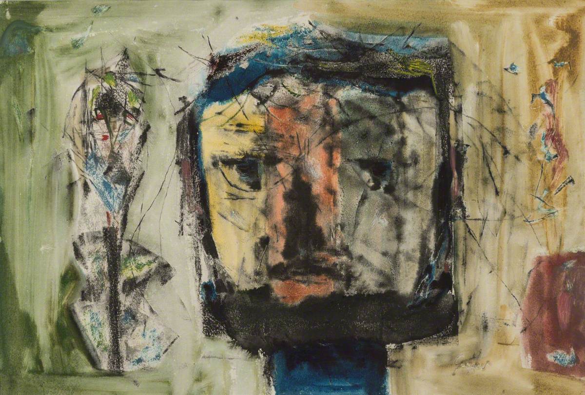
    Some interesting examples are the untitled landscapes in which the black marks prevail on apple greens, ochre, orange, vermillion and scarlet. Waves or round shapes contrast with the bold black marks intersecting with each other. We can imagine shapes of buildings, bridges, roads, or trees going upwards and roots digging downwards. The triptych composed in 1961 is reminiscent of human figures and uses striking reds contoured by black shapes that look like hollow ghosts, expressing an emptiness that cannot be resolved. Crozier’s vivid colours juxtapose with this desolate message, emphasising the vitality of his artistic production despite the artist’s awareness of the devastating human condition. The exhibition explains the complexity of Crozier’s message in a well-focused and exhaustive display of his artwork.

    William Crozier: Nature into Abstraction, The Lightbox, Woking, 2 April–19 June 2022


  • Bridget Riley: The Pleasures of Sight

    Bridget Riley: The Pleasures of Sight

    Bridget Riley, (1931-), Movement in Squares, 1961, Tempera on Hardboard. Photo © Arts Council  Collection, © Bridget Riley, 2021. All rights reserved 

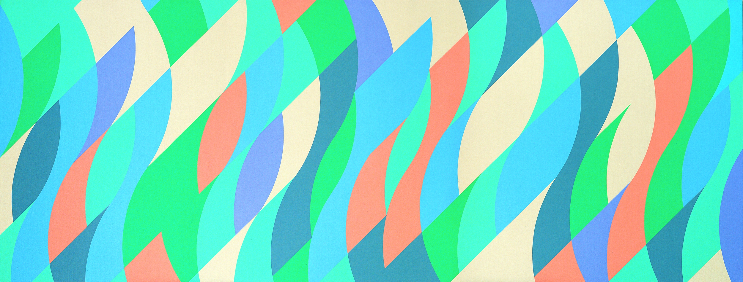
    Bridget Riley’s long and remarkable 70-year career is examined at the Lightbox’s exhibition to commemorate her 90th birthday. Her abstract compositions develop in triangles, oblong shapes, circles, spirals and above all stripes that evoke natural phenomena such as the sound of the wind and the movement of the waves. The secret of her success is incessant fresh experimentation in paintings and prints. Riley wishes to involve the viewer in an emotional experience that might trigger new perspectives of seeing. During the 1960s this dynamism was conveyed in optical illusions through colours and geometric forms in black and white, and then in the 1980s and 1990s in the use of greys and in the contrast between warm and cool shades.

     A keen observation and profound analysis of what surrounds her, especially of the natural world, form the basis of her art and her method. Riley spent her childhood in Cornwall then moved to London, where she studied at Goldsmiths College (1949–1952) and at the Royal College (1952–1955). Her early works are figurative in an impressionist style, as in ‘Women at Tea Table’, which is on display at the Lightbox. She then moved on to study Georges Seurat’s pictures, copying his pointilliste style, although she was not happy with the results. She felt that pointillism did not allow her to express her sensations or to understand the environment.

    In the 1960s there was a great desire for change after the horrors of the second world war. Riley saw the works of famous painters such as Cézanne and Mondrian and abstract painters such as Rothko and Pollock. Their work led her to abstract experimentation in black and white paintings, such as ‘Movement in Square’ (1961) and ‘Untitled (Oval Image)’ (1964). She produced dynamic movement on flat surfaces, expressing the forces present in nature, rather creating a landscape or a narrative. This movement was labelled Op Art, and it emphasises the effect of optical illusion within the works. However, Riley’s art was more complex; Op Art was a way to explore and understand her sensations and to involve the viewer in a fresher experience of sight. According to Riley, the viewer completes the artwork in the act of seeing, contributing to their own perception, which is personal and different. As she often remarks, her inspiration came from the movement of water and in the rhythm of wind that create repetitive patterns and, at the same time, shape and reshape the surfaces, suggesting continuous change.

    Bridget Riley (1931), Ecclesia, 1985. Oil on canvas © Arts Council Collection © Bridget Riley, 2021. All  rights reserved. 

    The effect of this interaction between colours and forms in movement was compared to the effects of seasickness and sky diving; they destabilise the viewer in order to induce a different experience that, according to Riley, evokes the pleasures of sight. From the 1970s she also explored relationships with colours, especially in the use of complementary colours alternated with greys. In the early 1980s she travelled to Egypt and created an Egyptian palette while studying the ancient hieroglyphs in the Valley of the Kings, in which the figures are organised in a sort of procession that the artist repeats in the stripe format, such as in ‘Green and Blues with Red (Orange Contrasts, 1985)’.

    Riley has dedicated her life to her art, which she called ‘a vehicle for my life’, a mission of sorts or a vocation that follows precise steps and a methodology that is simultaneously disciplined and open to further discoveries. Her ‘pleasure of sights’, as she stated in the 1984 essay with the same title, implies physical and mental pleasures, the joy of living and being alive that are based on intuitions and sensations, and she aims to understand and convey these feelings and consequently share the experience with the public. As she remarks in the essay, light has ‘elusive, unstable, flicking’, complex qualities that contribute to changing effects. This revelation of sorts ‘takes you by surprise’. These changes are ‘sudden, swift and unexpected’ and are the result of ‘a perfect balance between […] the inner and the outer’. This experience is mystical and contingent; it resists tales and aims for ‘pure sight’, a theory that combines spiritual and bodily involvement. As Paul Moorhouse remarks in his book Bridget Riley: A Very Very Person(2019), her work is ‘rooted in personal expression and expressed a personality’.

    In her recent works, Riley revisits past sketches and folios, creating new choreographic effects in her extended murals produced for the Tate, the Musée d’Art Moderne de la Ville de Paris and the National Gallery. In 2014 the Imperial College Healthcare Charity Art Collection commissioned her to make a permanent 56 metre-long mural for St. Mary’s hospital in London, and in 2017 a striped mural was installed in army barracks in Texas, Riley’s largest work that reproduces her Egyptian palette.

    Her artwork has been extensively exhibited both in Europe and in the US in group, solo and retrospective exhibitions. Her long career has developed in different directions; sometimes she contrasts forms and colours and at other times she merges them. She was always enthusiastic and hungry for observation and experimentation, making continuous progress towards fresh visions, evolving into new enthralling discoveries that might be unsettling but are also striving to attain a new harmony. Her artwork seems alive, similarly to the natural phenomena she is inspired by. Her work can be considered simultaneously poetic and controlled and evoking vitality and a dream, as well as having a stable symmetrical structure; it is a form of progress that envisages the coexistence of apparently opposing views. What is definite is that she does not stop to surprise the viewer and relentlessly triggers new visions. These multifaceted and ever-changing aspects of Riley’s work are thoroughly explored at the Lightbox exhibition, immersing the viewer in the wonders of her work.

    Bridget Riley: The Pleasures of Sight, The Lightbox, Woking, 18 December 2021–10 April 2022

    Bridget Riley (1931), Song of Orpheus IV, 1978. Acrylic on canvas © Arts Council Collection © Bridget  Riley, 2021. All rights reserved.
  • Art For Your World

    Art For Your World

    Elisabeth Frink (1930-1993) Rolling over Horse, 1979, pencil and watercolour © The Elisabeth Frink Estate and  Archive. All Rights Reserved, DACS 2021. Image courtesy of The Ingram Collection

    by Carla Scarano D’Antonio

    The new exhibition from the Ingram Collection at the Lightbox in Woking has been organised in collaboration with Artwise and coincides with the 60th anniversary of the founding of the World Wide Fund for Nature (WWF). The event also refers to COP26 (the UN Climate Change Conference in Glasgow) in order to raise awareness of this global issue, and displays 25 works of British artists who have been inspired by the natural world.

    The four works by Elisabeth Frink (1930–1993) on display are compelling examples. ‘The Cormorant’ (1974), from the seabird series, speaks of the horrors of the second world war that the artist experienced when she was living in Devon. She became obsessed by the war planes she saw fighting in the sky and imagined them falling to the ground. The birds recall the violence of the conflict but also have a defiant attitude; nature challenges the war and the craziness of mankind that caused it. ‘Sleeping Fox’ (1968) shows the beauty and harmony of nature in the relaxed posture of the animal, which is caught in a forgetful rest that resists the frantic life of urban society. Frink had a rural upbringing that is expressed in her pictures of animals, especially horses. In her artwork, work horses and war horses represent a crucial connection between nature and the human world. Horses work in fields and help farmers, and they took part in wars too; they were killed and maybe saved lives. Horses were not only soldiers’ companions but also supported them in tough times. The two artworks on display dedicated to horses are very different from one another. ‘Rolling over Horse’ (1979) in pencil and watercolour is a well-executed and skilful picture of an animal in a playful moment. It shows the beauty of the animal in its round shape and warm colours. ‘Wounded Horse’ (1989) in acrylic depicts the head of a bleeding war horse, emphasising its commitment and sacrifice. It represents the generosity of nature, which is at risk, and the message that is conveyed is that it is our responsibility to take care of it.

    Other interesting pieces include two intriguing sculptures. The ‘Elephant Revenge, 2012’ by Emma Woffenden represents the story of the revenge of a young elephant against the poacher who killed its mother. An impressive lion head carved in cherry wood by Seamus Cuddihy entitled ‘Scarface’ (2013) shows the proud portrait of the king of a pride of lions who was blinded in one eye during a fight.

    Landscapes in different media and techniques are on display as well. John Craxton’s ‘Landscape, Tresco’ (1954) represents a view of the Isles of Scilly using a figurative technique in watercolours and crayons. The buildings look stable and are protected by a fence, conveying a reassuring sense of order. In the semi-abstract ‘Landscape by the Sea’ (1958), Wilfred Avery imagines a place in which plants, rocks and sea interlace in an apparently flat surface, communicating a playful and vivid impression. ‘Hebrides’ (1999) by Donald Hamilton Fraser is particularly appealing because of the sharp contrast between the ultramarine and indigo blues of the sea and the red of the sky. The picture has been created using silkscreen printing, that is, a stencilling process that allows the artist to play with negative spaces. Sir Terry Frost’s ‘Sun, Sea and Boats’ (1952) reveals a keen observation and a juxtaposition of the objects mentioned in the title as well as an exquisite rendering in watercolours and gouache.

    The exhibition displays in a consistent and convincing way the connection between humans and nature and the relevance of plants, animal life and the natural landscape in our world. This relation is vital for our mental and physical survival and needs to be celebrated in art as well as in our everyday experience. We need to change our way of living and fall back in love with nature to make the world a better place.

    The Ingram Collection: Art for your World, The Lightbox, 25 September 2021–9 January 2022

    Donald Hamilton Fraser (1929-2009) Hebrides, not dated, print © the artist’s estate. The Ingram Collection

  • NightShaking with the Ingram Collection

    NightShaking with the Ingram Collection

    by Carla Scarano D’Antonio

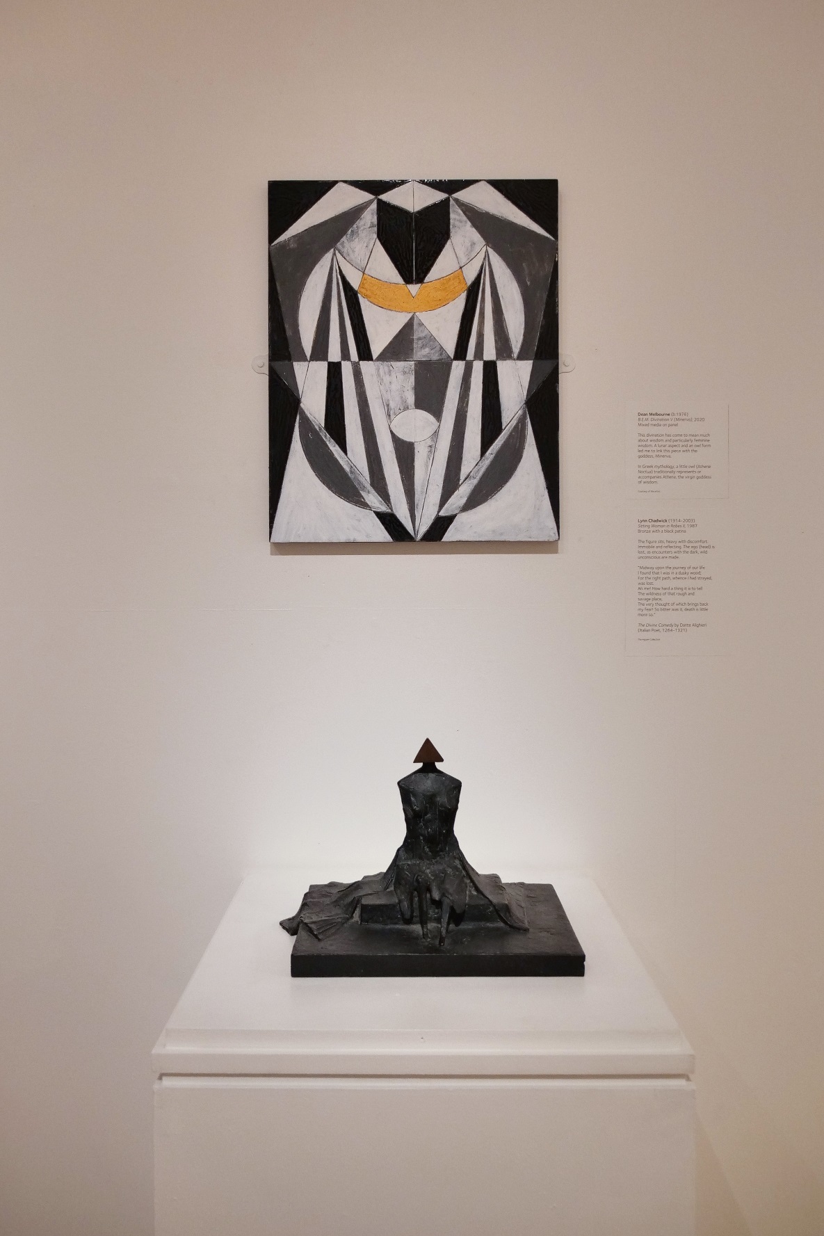
    Chantal Powell and Dean Melbourne are two contemporary artists who work in the fields of mythology and alchemy. Their artworks in the Upper Gallery exhibition at the Lightbox in Woking are powerful and dense with symbolism, tracing a journey from a dark challenging period to recovery. Powell’s and Melbourne’s pieces are on display along with works from the Ingram Collection that inspired them or are connected to their process of self-discovery and link their work to the wider art world.

    The NightShaking project is an artistic journey that encouraged the two artists to explore their personal lives. Their pieces are linked to alchemy for Powell and mythology for Melbourne. They both investigate the ‘dark night of the soul’, exploring their unconscious, and working with archives to develop their knowledge of myths and legends as well as their unconscious process related to these stories. It is a thought-provoking, mysterious process that is intended to express a poetic and personal journey from darkness to light. Archetypical images are evoked in Powell’s work that connect to a world in continuous transformation beyond the logical and realistic perception of our reality. For Melbourne traumatic experience implies the creation of an alter ego that produced his artwork. This experience is linked to the magical world of myths and folk tales. His pieces go from apparently controlled geometrical shapes to looser ink marks on paper.

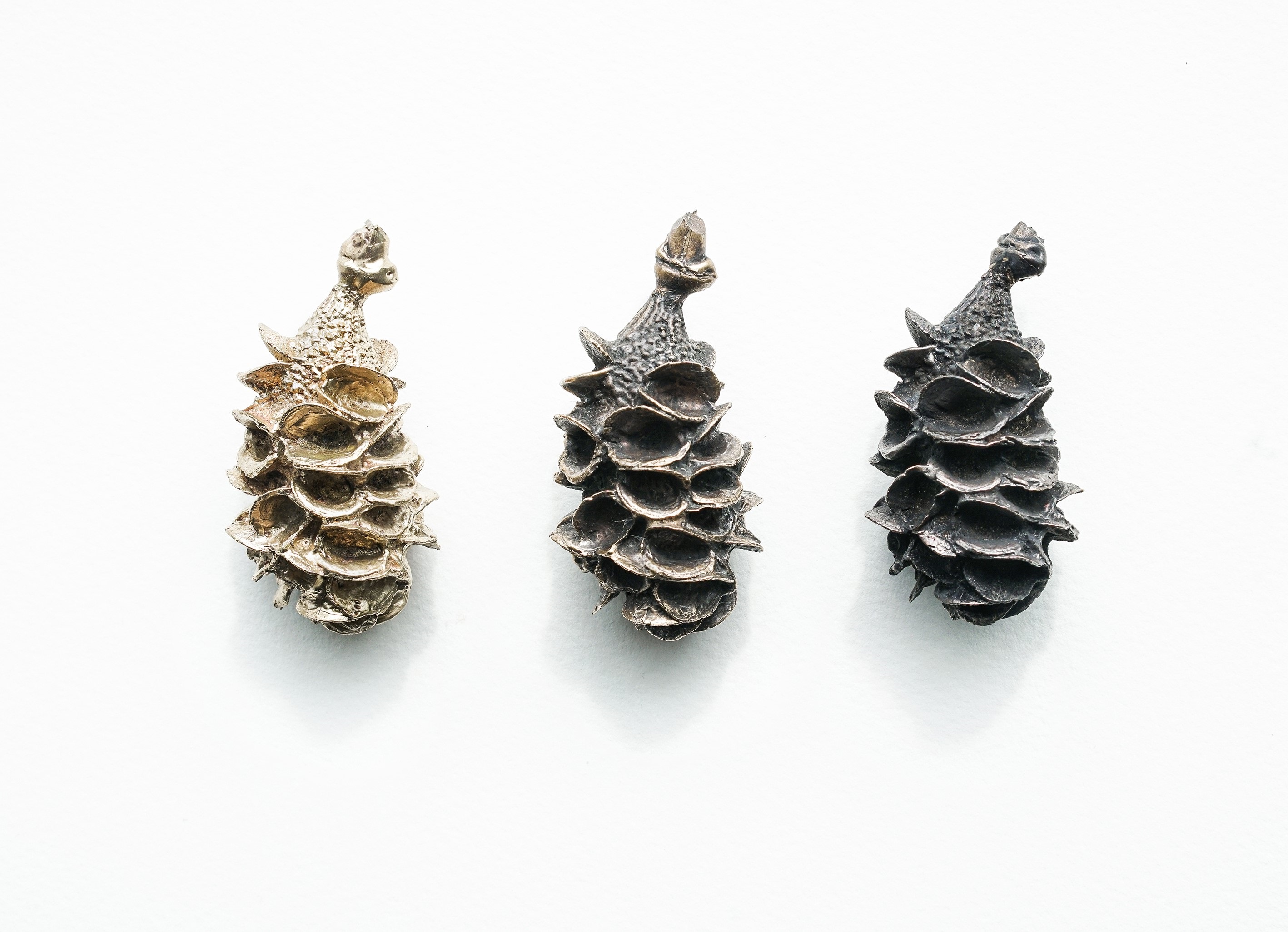
    ‘The Night Journey’ in hay, wire, straw and bitumen, by Chantal Powell – who has a PhD in social psychology – features a boat that suggests ancient vessels and is connected to ‘Bird’ by Elisabeth Frink. The sculpture is unsettling in its darkness and fragmented texture and links to the theme of the night sea journey, the moment of passage between dark and light. This journey implies encounters with the spirits of the underworld that speak to the living and offer them wisdom. The sculptures that represent this phase are round bronze pieces (‘Antecedent I and II’) with a serpent tail that represents the vision of the winding path that brings renewal. In the second room this recovery is displayed in the ‘Mandala Chambers’. They symbolise the ‘labyrinthine journey of the unconscious’, as Powell states in the caption. They are made of clay, then burnt in a bin, which is a process that highlights the alchemy of transformation. The results are in part unpredictable; it is a way to let go and trust the method. Some of the clay mandala may break, others are more beautiful and alchemical.  They become a reflection of the self, of sorts. In the second room there are also the ‘Dogon Ladders’ in black and golden bronze. They are both symbolic and real. The ladders are used in the material world but are also symbols that represent ascending and descending movements. They also connect to the natural world; in Mali the Dogon people carve ladders out from naturally forked trees. They have a simple, almost abstract form that is both artistically appealing and meaningful.

    Dean Melbourne’s process is complex in his double approach of loose work and geometrical paintings, which represent a way to control his dark side. His untitled works ‘illustrate the process of reduction’ as Melbourne, a Midlands painter based in the Black Country, worked through symbolic divinations that he meant to be a ‘porthole into the depth’. The pieces refer to a mythological journey into the underworld, the depth of a troubled unconscious. Marks trace an uncertain world full of haunting images and undefined subjects.

    ‘Crown’ is an outstanding piece. It describes the relationship of the artist with his own self-importance. As Melbourne remarks in the caption, it is the ‘less palatable side of my ego and vanity’. The piece is a re-assemblage of fragments from the destruction of an old painting in order to create the renewal that comes from a process of annihilation and reappropriation of a new self. There are two inverted golden triangles at the top of the painting representing an inverted crown and therefore an inverted self – that is, a change from who he was before. Thus, the re-assemblage present in the painting symbolises the reconstruction of the self in a journey that brings both to self-discovery and renewal. Reaching the end is an ongoing process that never ends. This enthralling exhibition guides the visitors in this journey where light emerges from darkness and engenders the possibility of regeneration.

    NightShaking with the Ingram Collection, The Lightbox, Woking, 10 July-19 September 2021

  • Impressionism: The Art of Life at the Lightbox in Woking

    Impressionism: The Art of Life at the Lightbox in Woking

    Lightbox Impressionists 3 Renoir

    Pierre-Auguste Renoir, A Garden in Montmartre, 1890 – 1899 Image © Ashmolean Museum, University of Oxford

    Carla Scarano enjoys and discusses works by Renoir, Pisarro, Cézanne, Sisley, Signac, Degas, Rodin and others


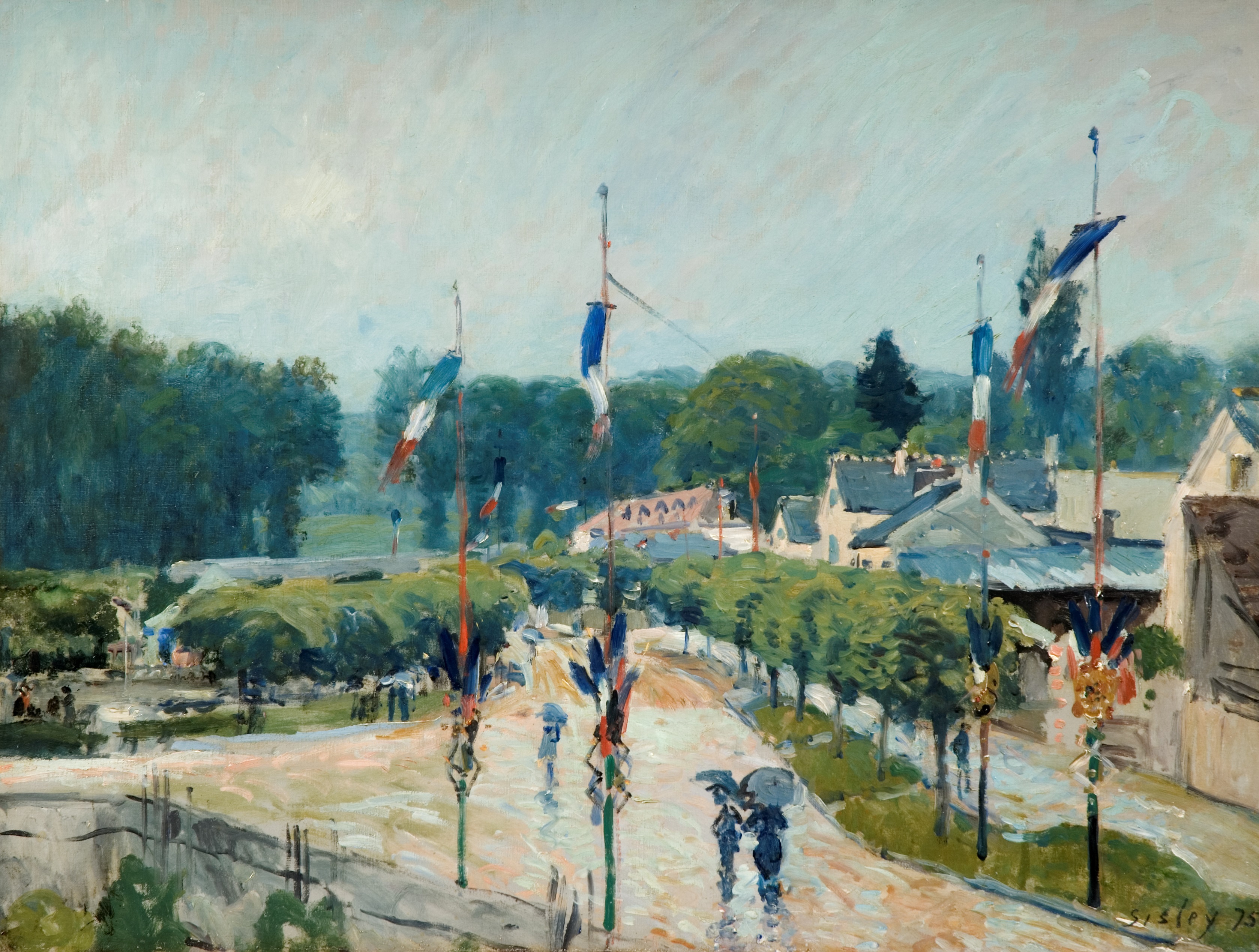
    A well-chosen number of works of the Impressionists is displayed at the Lightbox  ranging from Renoir, Pissarro, Cézanne, Sisley, Signac, Degas, Rodin and others. The clear captions and explanations condense effectively the themes, development and techniques of this famous French movement, and contribute to a successful understanding of the works on display.

    Though famous names, like Monet and Morisot, are missing, the works selected are not the usual well-known paintings we can admire at the National Gallery or at the Louvre, but unique, engaging pieces that allow a culturally engrossing experience.

    The Impressionists’ priorities were to paint en plein air (outdoors) and depict what they saw. They represented scenes of everyday life in contrast with the historical and mythological paintings of the Academy. A new, modern quality was the main characteristic of their works both in the themes and in the forms and colours. They represented what they saw, not idealised perfect shapes. For this reason, the contours might be distorted by the light or the atmosphere of the scene, or the colours chosen were different from what the viewer expected. In their work we find domestic scenes representing women sewing, combing their hair or rubbing their back, or work places. This gave a new dimension to the ordinary; the everyday life of common people came to the foreground without the obsolete, epic aspect of the works of the Academy. Their approach to painting was naturalistic; they never totally broke with past traditions, which instead occurred with the avant-gardes after them. Nevertheless, their work was considered unfinished and sketchy by their contemporaries, precisely an ‘impression’, not a real, complete picture.

    The exhibition well represents these characteristics in every aspect. The simple gesture of a dancer putting on her stockings in a Degas bronze sculpture expresses movement in its unstable position. It is familiar and ordinary, and reinterprets classical motifs. A similar solution is in the bust of ‘Woman rubbing her back with a sponge’ recalling a Greek Venus but in the context of a quotidian gesture. The lithograph of Mrs Cha-U-Koa dancing with her lover by Toulouse-Lautrec is evidence of the fascination these artists had for the world of cafés and cabarets. It also emphasises the movement of the people dancing in the marks that delineate their dresses.

    Rendering the bustling Paris life or a countryside landscape was a challenge the Impressionists accepted by depicting what they saw. They did not arrange the figures in artificial poses but referred to the immediacy of a snapshot as in Pierre Bonnard’s ‘Boulevard’, or to a ‘real’ space as in Paul Signac’s ‘River Landscape on the Seine’, where factories loom in the background and the transparency of the river emerges in the foreground. There is no idealisation in this scene, everything is factual; but it also reveals the painter’s personal view in its marks and choice of colours.

    Scenes of intimate, domestic life, such as the beautiful ‘Madame Pissarro sewing beside a window’ or Renoir’s ‘Woman nursing a Child’, reveal again the immediacy of the quotidian and the rendering of forms and colours from a personal angle where the effect of the light is fundamental and the emotions of the sitter are caught in an instant. A similar ephemeral moment is in Éduard Vuillard’s still life, ‘The Blue Inkwell on the Fireplace’, where the arrangement of the different objects is both casual and effective.

    An impressive statue by Rodin, ‘Crouching Woman’, is on display as well. It represents a restless figure in a reclining pose recalling the Parthenon friezes Rodin studied at the British Museum. For him they seemed alive, in motion, conveying a creative force that he wished to attain in his work. The emotions are expressed in the tension of this body which is missing an arm, like an ancient Greek statue mutilated by the wear and tear of time. It was a way to see a subject from different perspectives and combinations, similarly to Degas’ dancers, and it also emphasises the sense of movement. This challenged the concept of the work of art as a unique product, its heroic and epic status, so praised and cherished by the academies. It was a more down-to-earth vision of the subject.

    The Impressionists’ paintings are still very popular and fascinating for today’s audience because of their fresh way of depicting modern life in ordinary scenes avoiding the monumental or the heroic, focusing instead on transient moments which are felt as more genuine though temporary.

    In the Lightbox Upper Gallery, from 13 October 2018 to 6 January 2019, there is also the exhibition dedicated to Elizabeth Frink from the Ingram Collection, which displays her drawings, paintings and sculptures. The artist lived in Dorset and in London and expressed her art mainly in large sculptures representing masculinity in its courage but also violence and potential fragility. The war influenced her work with its uncertainties and destructions reflected in the figures of the fallen horses and in the heads, or in the ‘Spinning Man’, where the vulnerability of the subject is revealed in its slumped pose and in its stupor facing a possible end.

    There are also talks, workshops and tours associated with these exhibitions at the Lightbox, giving to the public the opportunity to develop further their understanding of theses outstanding artists.

    Impressionism: The Art of Life is displayed at the Lightbox until 13 January 2019

    LIghtbox Impressionists 2 Vuillard

    Edouard Vuillard (1868-1940), Le Salon c.1910, oil on card laid on canvas, 615 x 680mm. Image courtesy of The Henry Moore Foundation acquired 1984

  • Lightbox literary festival to become the Woking literary festival in 2019

    Lightbox literary festival to become the Woking literary festival in 2019

    20180606_134338

    The Lightbox literary festival is to significantly expand in size and will be renamed the Woking literary festival from 2019, after two successful years and a recent cash injection from Woking council. The festival was launched in 2017 and will run over 10 days at the Lightbox gallery and museum in Woking.

    Two Woking Writers Circle members, Catherine Rogan and Greg Freeman, were involved in the 2017 festival, Catherine interviewing author Nicola May and Greg compering three hours of open mic poetry plus special guest poets. Greg was back at the Lightbox festival earlier this year, compering four hours of poetry on behalf of Write Out Loud Woking, an open mic poetry night which now meets each month at the Lightbox. In its press release the Lightbox said that “the festival’s hugely successful collaboration with Write Out Loud Woking continues to bring performance poetry and the spoken word to audiences across Surrey”.

    The 2019 festival will run from 23 April to 2 May. Louise Musgrove, festivald  director, said: “We have had a wonderful first two years, with great authors and big attendances, and are looking to expand on that with the ambition to become an important festival in the literary calendar. In the past we have approached authors ourselves and asked if they’d like to attend but we are hoping that publishers will want to pitch their authors, both well-known and up and coming, to us in future. After all, we sell a lot of tickets and a lot of books. All attending authors will be paid a fee and travel expenses will be covered. We’ll also give them some nice grub while they are here.”